Redesigning IKEA Indonesia
Mobile App Interface

2020
2.4/5 rating on an app created by a multinational company like IKEA surely raise a question mark. But after spending quite some time on the app, apparently it was rated 2.4 for some reason–slow & unresponsive, outdated & cramped interface, and lacking the online store's essential feature (bookmark, etc)

As a designer, I took the initiative to redesign the app as an attempt to solve the problems & improve the app from UI aspect

Role & Responsilbility

Solo Designer–discovery, user research, ideation, design, testing

Tools of Trade

Figma

Table of Content

Disclaimer: This project is no way affiliated with IKEA Indonesia, and for educational & research purpose only

1. Discovery

Why this project needs to happen?
having an unusually low rating on an app created by a multinational company, especially IKEA, is not something that everyone expect. So, as a UX designer, it’s only natural to figure why does the app rated unusually low and try to propose the solutions to the problems.
Review from app version 1.2. We all know IKEA could do better than this

2. Research

To gather more insights on what makes the rating so low, I conducted a research by:
1. Reading app review on App Store
2.Conducting user testing the current app
3.Interviewing user about their experience while using the app
The obtained insights were categorized into 3 aspects/categories: functionality, usability & experience, and visual aspect
Most complains are about the app's performance & app's UX. Since the main focus of the project is to solve the problem from [UI/UX] design aspects, therefore reviews that will be taken into consideration are ones regarding the UI/UX of the app.

3. Current app analysis

To validate the claims & sayings, I conducted a user testing with the interviewee being the participant. I gave the participants a set of basic online shopping activity to complete–creating profile, adding address, explore the categories and items, search for an item, add the item to cart, and checkout & see how they perform all the tasks and the problems they encounter.

Here’s the breakdown of the current app & outcome from the conducted test:
Current app analysis

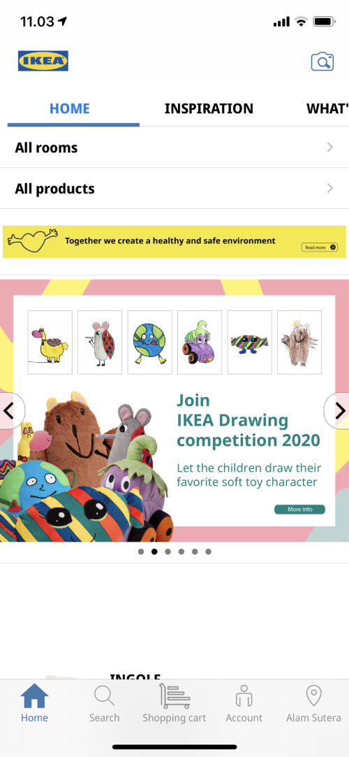
Home

Poor space management. It’s either too stuffed–cluttered, or too spacious & taking up too much unnecessary space.

The entirety of the app also lacking the brand identity since the interface of the app itself is predominantly white; doesn't have much color/visual element that represents IKEA.

Some elements are barely noticeable–category section for one; all rooms & products due to poor visual hierarchy. The lack of visual element also causing the page not very intuitive
were unable to directly find the category section directly
Current app analysis

Home–Inspiration

Customer will be redirected to their website instead of showing the post on the app–unable to read the post from the app; inconvenient.
“If customer can’t read the post from the app, what’s the point of having blog section on the app then?"
"The redirection to website is annoying, making them hesitant to view the blog post"
Current app analysis

Home–What's New

What’s New page consists of (only) two elements–a slider for inspiration & a slider for new items. To view the content, customer needs to slide the items over one by one; impractical to navigate.

The product on the page were also shown at random; uncategorized
Current app analysis

Product page

There’s no rating & review system present on the app, and 80% of the participant felt missing out since they rely a lot on rating & review system to make decision while making a purchase.
"-felt missing out due to the absence of rating & review on the app"
Current app analysis

Checkout

Checkout button placed at the top of the page–unconventional. All the testing participants were used to have the checkout button at the bottom of the page, therefore participants found it bothersome.

It’s also hard to reach anyway when the button’s placed on top of the page–impractical
"-agreed that checkout button placed on top of the page feels awkward"

4. Problem

After doing the research by reading the App store reviews, interview, and user testing, it can be summed that:
1. Lacking the essential online shop feature–bookmark, rating & review system, in-app notification
2. Unpleasant UI design–outdated design, cramped & cluttered, not very intuitive
3. Annoying redirection to view [in-app] content

5. Goal

After having  a better understanding of the current state of the app, user, their problems, and their needs, I got a better vision on how the redesigned product should to be:
1. Giving a fresh–new look to the app’s interface
2.Completing the online store’s essential features that are unavailable on the current app
3. Making the most of the blog feature, so customer can spend their time on the app outside the shopping activity; serves more purpose
Below are the ideated solutions/ "How might we" to achieve each of every redesigning goal I came up with. Although, due to time & resource limitation at hand, some of the ideated solutions didn't make to the designing process; the light grey–non colored ones.

6. Final Design

All the designing process were done in Figma. The designed prototype the later got tested by the previous interview participants to collect their thoughts and opinion about the newly designed app interface.
Final design

Home

The space and placement of the elements have been adjusted to redefine the visual hierarchy & give the page more spacious–less cluttered look.

Notification bell has also been added on the upper right corner to accomodate the presence of in-app notification; update on order status, promotion.

For the categories (all rooms and products), I added the visual of the respective category so user know what to expect when they open the category page–more intuitive. By adding visual to the sections, it draws the user’s attention more so it would be easier to find
"-said it's much easier to spot the category section compared to the pre-redesigned app; intuitive"
Final design

Bottom Navigation Bar

The bottom navigation have been revamped by by changing the color & content of the nav-bar

The color of the nav-bar is now blue & yellow for the; IKEA's brand color, to incorporate more brand element to the entirety of the app; more on brand

The nearest store section has been replaced with saved feature for user to access their saved item & collection.
An input on the bottom nav-bar, one of the participants pointed to not change the icon of the cart since the in-store IKEA cart looks like the one on the old nav-bar; iconic.
Final design

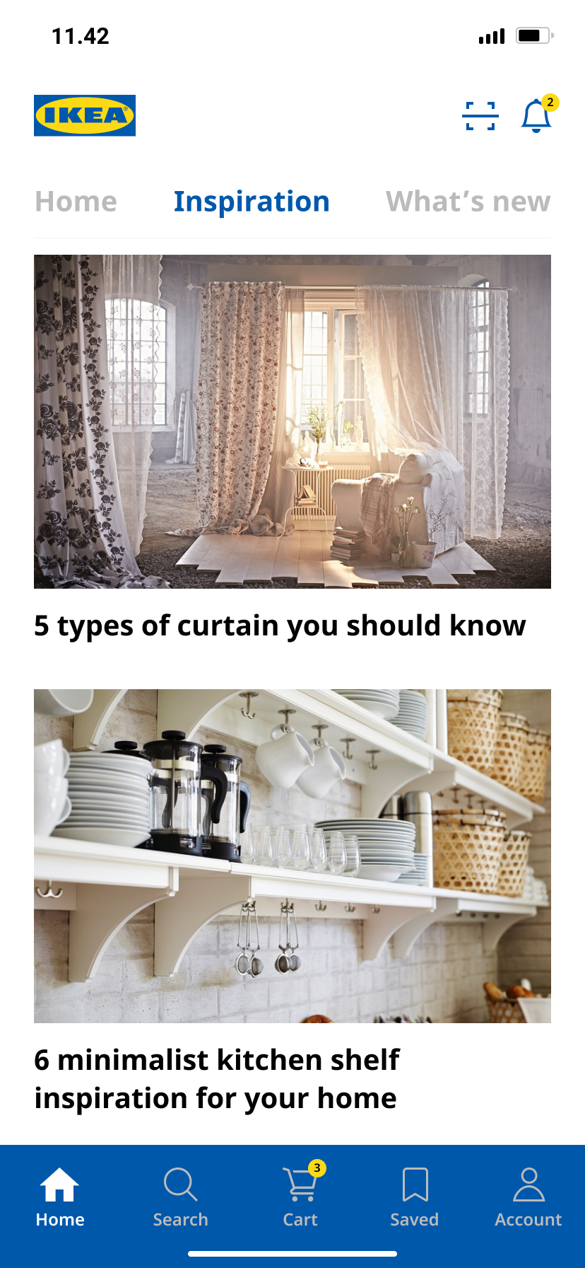
Home–Inspiration

User now can read the blog post right from the app, eliminating
the inconvenience of being redirected to their website.
"-now might consider to view the blog post after the flow iteration"
One other participant simply might not because they’re not really very fond of reading.
Thumbnail of the featured products were also added so customer can quickly view or add the item to cart straight from the blog post.
Final design

Home–What's New

What’s new page is now categorized by major product categories for easy searching.
Final design

Category–Product

This pages were redesigned to match the newly designed app’s UI & to improve browsing experience, not being problematic per se.

The layout of the categories were changed since the size of picture on each category is now bigger. With the newly designed layout, it’s actually possible to fit up to 15 categories in one frame–compared to only 9 categories in one frame on the current app.

Bookmark/save icon is now available on each product thumbnail for quick & easy marking.
Final design

Category–Room

Room categories are now showing not only the items of the respective room, but also featuring blog posts about room inspirations.
Scroll down for a bit, and customer can find Ideas & soluitions–a series of article/blog post containing thematically-curated products.

Having an article/blog post for customer to read can pique their interest, therefore more likely to spend more time on the app.
Final design

Product page

Bookmark and rating system are now available on the product page, completing the online shop essentials that is unavailable on the current version of the app. The page design & elements were also tailored to match the newly designed app
Final design

Bookmark

User are now able to mark their favorite items. With collection available within thebookmark page, user can group their marked items accordingly.
Prototype
Post-revision
Final design

Checkout

The space and size of the elements have been adjusted accordingly. Summary & checkout button have also been moved to the bottom of the page for easier access
One of the participant mentioned they would like to be able to select which item they wanted to checkout, allowing them to decide which item leaves or stays on the cart.

7. Learning

It’s a really fun project and quite challenging I might say, since I limited myself to finish the whole designing within a week. And judging from the response & feedback on the newly-designed interface from the participants, I believe it  accomplished the goal of the designing project.

Here are some things I picked along the way:

1. The importance of spacing & layouting

Isn't it cool that white space is practically....nothing; a mere blank space, yet it does so much things to create a better viewing experience. It helps everything on page looks structured, helps user to find things easier, increases page's readability, and helps to emphasize visual hierarchy. How cool is that?

2. Design process doesn't happen in a straight line

Design process isn't as pretty as the structure/template you find all over the internet; it's messy, it's going back & forth. One step forward and two steps back. So don’t constrain yourself to the typical–textbook–design thinking–order. Simply use them as a guideline & adjust to the circumstances accordingly.

3. The importance of story telling & writing skills

To be able to present and convey the designed solutions to the audience in an engaging & effective manner is very important for designer since we want our audience to understand & get the intention behind the designed solution.

Imagine you created a very well-designed solution but unable to convey it to the audience, so the well-designed solution get lost in translation. It would be a bummer, wouldn't it?